
The alarm clock colour that sleep scientists say is least likely to disturb your rest
Most of us blame late‑night scrolling or coffee for groggy mornings. The thing that actually jolts your brain every day sits 30 centimetres from your head: your alarm clock. The colour of its display sounds trivial until you learn your eyes treat different light wavelengths like different commands.
Sleep scientists have been quietly testing those signals for years. Their verdict: if you want an alarm that wakes you without wrecking the last part of your sleep, colour matters more than volume or brand.
Why light colour affects your sleep in the first place
Your body clock runs on light. Special cells in your eyes send messages to the brain that say “it’s day” or “it’s night” based on the brightness and wavelength of what they see. Blue‑rich light, the sort found in phone screens and daylight LEDs, acts like a loud “wake up now” notification.
Red and amber light sit at the other end of the spectrum. They have far less impact on the body clock and melatonin, the hormone that helps you fall and stay asleep. That’s why astronomers, pilots and night‑shift clinicians often work under dim red or amber lighting when they need to see without fully waking their brains.
In lab studies, blue light suppresses melatonin strongly; deep red barely nudges it. Your bedside display is a tiny version of that experiment, every night.
The display colour that disturbs you least
Put simply: a dim red display is the least likely to disrupt your sleep. Amber is a close second. Both sit in a wavelength range that your circadian system treats as relatively “quiet,” especially at low brightness.
By contrast, bright white or blue‑tinted digits punch above their size. Even when you think you’re ignoring them, that glow can nudge your brain towards daytime mode, fragmenting lighter sleep stages and making it harder to drift back off if you wake in the small hours.
From a sleep‑friendly standpoint, the hierarchy looks like this:
- Best: deep red digits on a very low brightness setting.
- Good: soft amber or warm orange, again kept dim.
- Risky: green, cool white or ice‑blue displays at medium to high brightness.
- Worst: bright blue or white screens that light the whole room.
The colour alone is not magic. The combination of hue, intensity and distance from your face makes the real difference.
How colour and brightness change the wake‑up experience
The goal is not to avoid waking up. It is to avoid shredding the quality of the last stretch of sleep before your alarm sounds, and to reduce the “shock” when it does.
With a bright blue or white display, your eyes catch that glow every time you half‑wake and check the time. Each glance delivers a mini dose of day‑signal. Over hours, that can:
- Shorten your final sleep cycles.
- Increase the odds of waking before your alarm.
- Make you feel wired yet oddly unrefreshed.
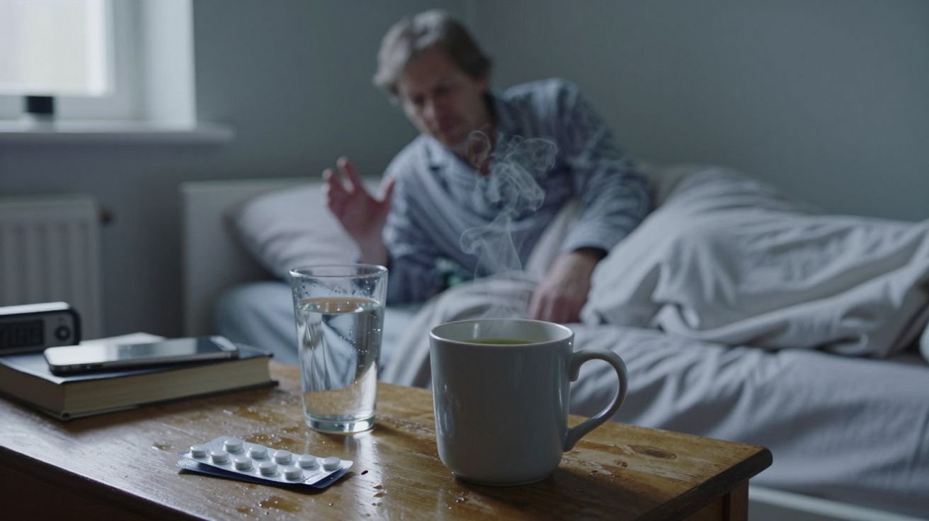
A dim red display, by contrast, lets you check the clock without a strong circadian hit. The numbers remain legible at arm’s length, but they do not flood your retina with high‑energy light. People using these clocks often report that:
- It is easier to roll over and fall back asleep after a quick time check.
- The alarm itself feels less brutal, because sleep has not been pushed towards “light day mode” beforehand.
- Middle‑of‑the‑night wake‑ups feel calmer and shorter.
Think of red as a whisper and bright blue as a shout. Both wake you, but one leaves far less echo.
A quick comparison
| Display type | Circadian impact at night | Best use case |
|---|---|---|
| Dim red | Minimal | Everyday bedside, frequent time‑checks |
| Soft amber | Low to moderate | Bedside in slightly brighter rooms |
| Bright blue/white | High | Daytime desk, not the bedroom |
How to choose (or tame) your alarm clock
You may not need to buy anything new. Many current clocks, phones and smart displays already include settings that mimic what sleep labs recommend; they’re just buried in menus.
If you use a traditional clock
Look for:
- Red or amber digits, not bright white or neon blue.
- Adjustable brightness, ideally with a true “very dim” setting rather than just “low”.
- A flat or downward‑angled display, so light does not shine straight into your eyes.
If your current clock glows like a torch:
- Turn the brightness to the lowest possible level.
- Angle the display away from the pillow.
- If needed, tape a strip of neutral or red‑tinted film over the display to soften the light.
If you rely on your phone as an alarm
Phones are designed for daytime use, so you need to bend them towards night mode:
- Enable night mode or blue‑light filter from your usual bedtime until after you wake.
- Turn the brightness right down before you put it on the bedside table.
- Place it face‑down or on a stand so the screen does not glow at you with every notification.
- Use an alarm setting that wakes from a dark screen, not an always‑on display if you can disable it.
If your handset offers a “red filter” or “sleep” profile, use that for overnight hours. Some smart home displays now include an automatic shift to a dim red clock at night; that is exactly what sleep experts prefer.
Extra tweaks that actually help you rest
Colour is one piece, not the whole puzzle. If you are already investing in a better‑behaved alarm, these small tweaks amplify its effect:
- Keep the room as dark as practical. Street lights and standby LEDs add up; black‑out curtains and covering bright indicators make a real difference.
- Choose a gentler alarm sound. A gradually rising tone or vibration wakes you just as effectively as a blast of static, with fewer stress spikes.
- Resist repeated snoozing. Multiple alarms fragment sleep and blunt the natural waking process, no matter what colour the display is.
- Place the clock slightly away from your head. A metre or so reduces light intensity and forces you to move to turn it off.
Over a week or two, those small changes often translate into easier mornings and fewer complaints about feeling “wired but tired.”
When to take it more seriously
A calmer display will not fix underlying sleep disorders, long‑term insomnia or the effects of chronic stress. Signs you may need more than a new alarm clock include:
- Regularly taking longer than 30 minutes to fall asleep most nights.
- Waking up multiple times and struggling to return to sleep.
- Loud snoring, choking sounds or gasping in the night, noticed by a bed partner.
- Persistent daytime sleepiness despite a reasonable time in bed.
In those cases, your alarm colour is still worth improving, but it should sit alongside a chat with your GP or a sleep specialist rather than replace it.
FAQ:
- Is red light guaranteed not to affect my sleep? No light is completely neutral, but dim red has much less impact on melatonin and your body clock than brighter blue‑rich light, especially when the display is kept small and a little distance from your eyes.
- Is a green display better than blue or white? Green generally sits between amber and blue in terms of circadian impact. It is usually better than bright blue or white, but still not as sleep‑friendly as a dim red or soft amber display.
- Do sunrise or wake‑up lights help more than a red display? They target a different problem. A red display reduces disruption during the night; a gradual sunrise simulation can make the final wake‑up feel more natural. Many people benefit from using both: red digits overnight, then a timed brightening light in the last 20–30 minutes of sleep.
- If I sleep with a mask, does my alarm colour still matter? A good, opaque sleep mask blocks most ambient light, so display colour becomes less important. However, many people remove or adjust masks during the night without noticing, so choosing a gentler colour is still a sensible backup.

Comments (0)
No comments yet. Be the first to comment!
Leave a Comment