The colour on your front door that estate agents say quietly adds value to your home
There is a particular twinge you feel when you scroll past yet another “dream home” listing, all sage walls and bi-fold doors, and then glance back at your own front door. The paint is a bit chipped at the bottom, the handle has seen better days, and the colour… well, it made sense when you chose it ten years ago. Now it mostly looks like background.
Then you spot the same thing, again and again, in the listings that make people suddenly lean forward. A certain kind of door. A certain depth of colour. Not shouty, not eccentric, but quietly, almost unfairly expensive-looking. You can’t always name the shade, but you know it when you see it.
Estate agents know it too. They will talk to you about square footage, “flows of light” and transport links. But ask what first impression really nudges buyers’ brains, and sooner or later they will drop their voice slightly and say, “The front door. And ideally, a deep, elegant blue.”
Why the front door sets the price tone before anyone’s inside
Walk up to a house viewing and your mind starts work before the key even hits the lock. The path, the plants, the porch light - they all whisper little stories about what kind of life might happen here. The front door is the one part you actually touch. It becomes a stand‑in for the whole building: solid or flimsy, cared for or neglected, considered or chaotic.
Estate agents will tell you that buyers make a rough emotional judgement in the first 30 seconds outside. They are not calculating ceiling height; they’re asking themselves, “Does this feel like a place I’d be proud to invite people to?” A tired, yellowing UPVC door or a once‑white gloss now more cream‑with‑grime answers that question before the hallway gets a chance.
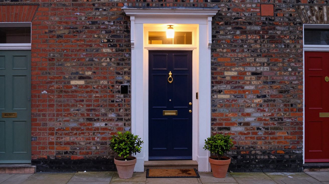
That’s why certain door colours appear again and again in the homes that attract multiple offers. Deep, saturated tones - navy, inky blue, almost‑black blue - telegraph calm, stability and a bit of quiet money. They suggest the owners think about details, but not in an overly precious way. An agent in Surrey put it bluntly: “A good blue door tells buyers, ‘We upgrade things properly, not just in a rush before the photos.’”
No one is claiming a tin of paint adds tens of thousands to the asking price by itself. But when several houses sit in the same price band, the one whose front door makes people exhale rather than flinch tends to climb the shortlist faster. In a market built on small nudges, that matters.
Why deep blue keeps winning over buyers
If you ask colour psychologists, they’ll reach for words like “trust”, “reliability” and “composure” when they talk about blue. Estate agents use plainer language. They say things like, “It looks smart,” or “It feels grown‑up”. Both are describing the same effect: blue calms the visual noise of a street.
Think of the last cul‑de‑sac you walked down where one door screamed orange, another neon green, and the rest muddled along in various shades of patched‑up white. Your attention snapped to the loud ones, but not in a way that said “quality”. Now imagine the same street where two or three doors sit in a rich navy or deep petrol blue against pale brick or render. They don’t shout. They steady the whole scene.
Dark blues also have a neat, boringly practical advantage: they hide scuffs better than black and dirt better than lighter colours. A glossy black door can look brutally unforgiving in harsh sunlight and every fingerprint shows. A very pale door shows every speck from a rainy day. Deep blue sits in the middle, absorbing imperfections while still looking crisp in estate agent photos.
One London agent described wrapping up viewings on a row of near‑identical Victorian terraces: “The one with the navy door and polished brass knocker always felt like the ‘best kept’, even when the hallway was the same beige as next door. Buyers assumed the rest of the house had been looked after. That’s the power of one rectangle of colour.”
The small design cues that make a door look “expensive”
It’s tempting to think you just pick a nice shade, slap it on and job done. That’s how you end up with the slightly sad, streaky doors you see on Sunday walks. The doors that quietly suggest, “We did this in a panic the week before the photographer came.”
The doors that really change a buyer’s mood share a few unglamorous traits:
- The colour is rich, not flat - think navy, ink, or deep blue‑green rather than bright cobalt.
- The finish is even, with clean edges around glass, frames and letterboxes.
- The hardware matches and looks intentional: all brass, all chrome, or all black, not a jumble.
- The area immediately around the door - step, mat, frame - is clean and uncracked.
A heritage‑style deep blue on a panelled door with a simple brass knocker reads as classic and quietly upmarket. The same blue on a modern slab door with slim black handle can look sharp and contemporary. In both cases, the colour does part of the work, but the story is completed by the details around it.
One agent said he can often spot a “decorated to sell” house from the driveway: fresh, slightly too‑bright paint, mismatched handle and letterbox, weeds in the path. It signals last‑minute theatre, not long‑term care. A well‑chosen deep blue, paired with tidy hardware and a swept step, feels more like the owners did this years ago because they liked it - not because Rightmove was looming.
How to choose a blue that helps, not harms
Standing in front of a paint display, most of the blues start to blend into one shimmering wall of confusion. At home, under English clouds and streetlights, they behave very differently. The same shade that looked like “smart navy” on a sample card can read as flat black or dull grey on your door.
A few simple rules keep you out of trouble:
- Check the direction your door faces. South‑facing doors get strong light; darker, inky blues work well. North‑facing doors benefit from slightly warmer or greener blues to avoid looking lifeless.
- Test at least two samples on the actual door and look at them morning, afternoon and dusk.
- Avoid very bright, almost primary blues if you’re aiming for broad buyer appeal.
- Check what’s happening on your street: a tasteful echo of surrounding colours feels harmonious, while going wildly off‑piste can put buyers off before they park.
Many paint brands now have “heritage” or “classic” ranges; their deeper blues tend to be softened and slightly greyed‑off. Those are the ones estate agents quietly nudge people towards, because they look more expensive and are harder to get badly wrong. Think along the lines of navy, indigo, or a deep teal rather than “royal blue”.
One agent in Manchester tells clients to do a very simple test: stand across the road and take a photo at 3pm on a typical cloudy day. If the door reads as “nearly black, but softer”, you’re probably close. If it reads as “shouting blue box”, you might want to nudge darker or dustier.
The little maintenance habits buyers subconsciously clock
A freshly painted door will always look better in the listing photos, but what really reassures buyers is the sense that it will still look good next year. That’s where the unsexy stuff comes in: cleaning, tiny touch‑ups, and hardware that isn’t wobbling itself off.
Estate agents notice the same patterns again and again:
- Clean glass panels and sidelights signal general care.
- A door that opens smoothly without a shove suggests the frame and hinges are sound.
- A letterbox that closes properly and a handle that doesn’t rattle hint at decent fittings, not the cheapest online option.
- Flaking paint along the bottom edge or rust blooming around screws raises questions about hidden damp or shortcuts.
None of these things appear in the listing. They appear in the buyer’s nervous system when they grab the handle. A deep blue door that feels solid under the hand and looks clean around the edges makes them relax a notch. Relaxed buyers are more generous in how they read everything else inside.
One agent summed it up: “If the front door looks like it’s been loved, people are less suspicious of the boiler cupboard. It buys you goodwill.”
A tiny project with outsized psychological impact
Repainting a front door is not the sort of renovation people boast about at dinner. It feels too small, too domestic, especially next to kitchens, extensions and loft conversions. Yet in terms of cost versus effect on perception, it’s one of the rare jobs that punches far above its weight.
You are not changing the market. You are changing how your house enters the room in buyers’ minds.
A considered deep blue on a tidy door won’t magic away a tiny kitchen or a busy road. What it will do is set a tone of care and calm before any of that arrives. It says, without a word, “This home has been looked after.” Estate agents see that message land dozens of times a week, in subtle shifts of posture, slower exits from viewings, and the phrase, “I just liked the feel of it.”
And in a market where feeling tips so many decisions, that one quiet rectangle of colour is doing more than it gets credit for.
| Key point | Detail | Why it matters to you |
|---|---|---|
| Deep blue reassures buyers | Reads as calm, stable and quietly “smart” | Helps your home feel cared‑for before anyone steps inside |
| Finish and hardware count | Clean lines, matching fittings, no flaking edges | Signals quality and long‑term maintenance, not a rushed spruce‑up |
| Context and light shape the colour | Direction, neighbouring houses and daylight all change how blue appears | Testing in real conditions avoids picking a shade that jars or falls flat |
FAQ:
- Does a blue door really increase my home’s value? Not directly in pounds, but it can improve first impressions and make your property more competitive against similar homes, which often translates into stronger offers or a quicker sale.
- What if every other house on my street already has a blue door? That’s usually a good sign; buyers read it as a desirable, well‑kept area. You can still stand out with a slightly different depth of blue and better finish and hardware.
- Can other colours work as well? Yes - classic black, deep green and soft charcoal are also agent favourites. Deep blue simply hits a reliable sweet spot between character and broad appeal.
- Is gloss, satin or eggshell best for a front door? Many professionals favour satin or semi‑gloss for exterior doors: they’re easier to keep clean than matt and more forgiving of imperfections than full gloss, while still looking smart in photos.

Comments (0)
No comments yet. Be the first to comment!
Leave a Comment